The Wanderer Magazine
Role:
Personal Project
Editorial Design
Layout Design
Image Retouch
Tools:
InDesign
Photoshop,
Illustrator
Concept
Just recently I watched a few documentaries about unique travel experiences and wondered what it would be like to not be tethered to responsibilities, to get in an RV and travel the world like a gypsy. Imagine sleeping in a tree house or an ice castle or perhaps a 737 fuselage? What about a haunted ship? That is where I came up with the idea for the magazine The Wanderer. The magazine is designed to showcase unique and unforgettable experiences. It is a quarterly travel magazine for the not so average traveler.
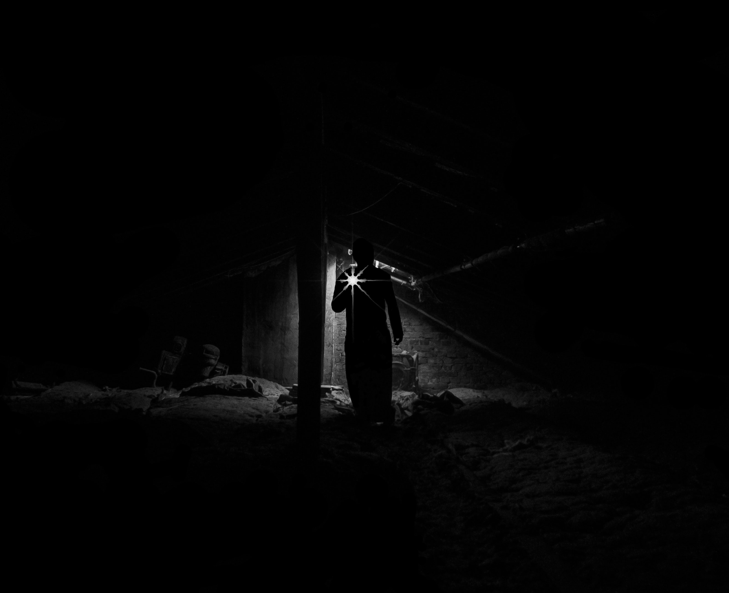
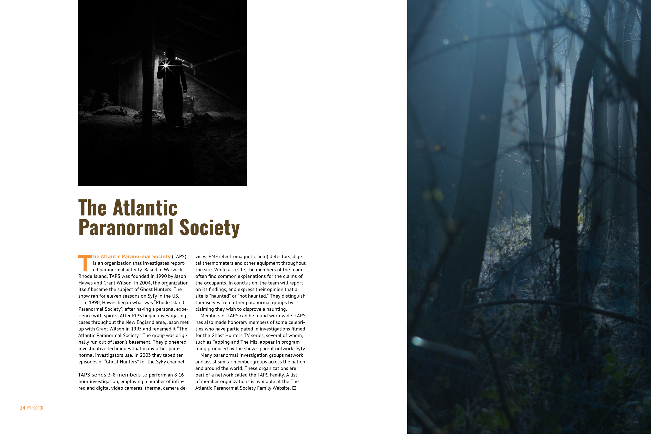
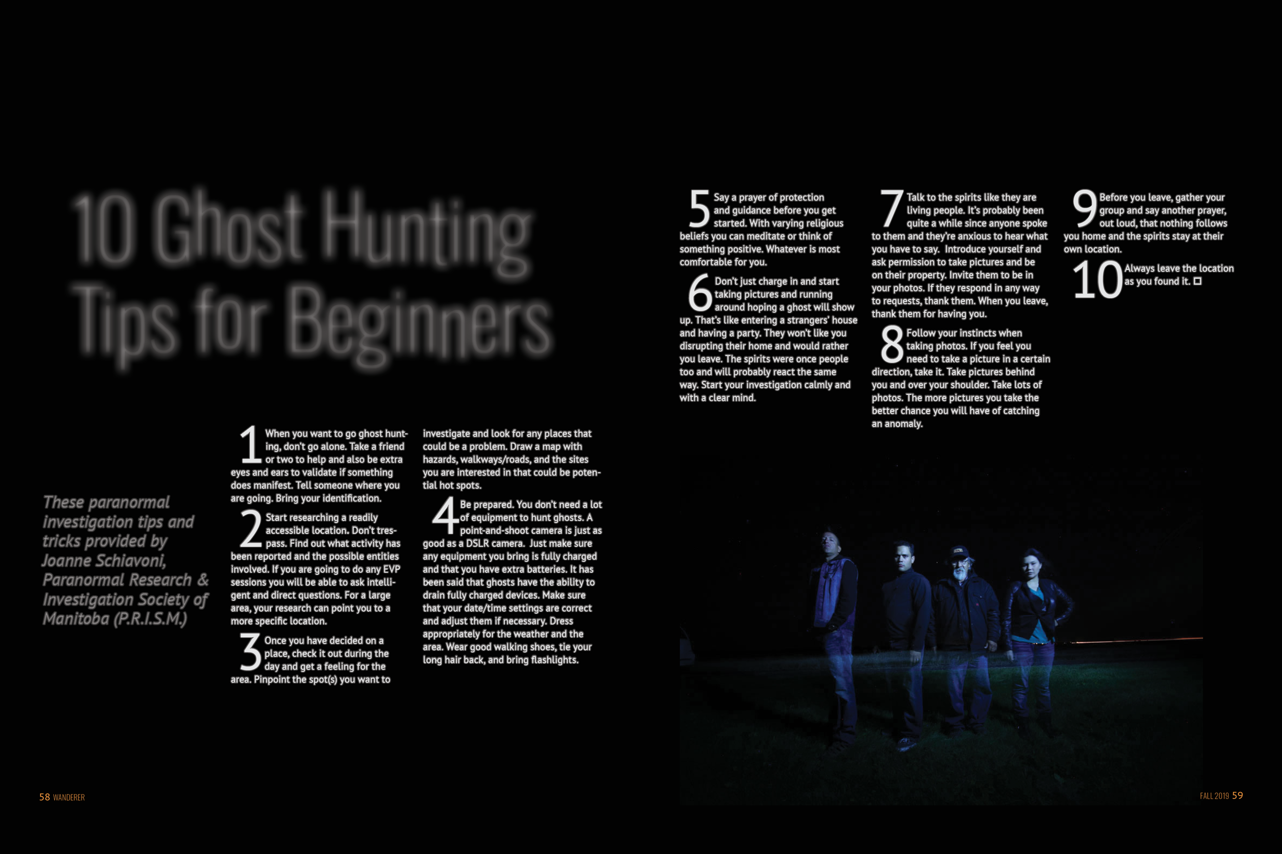
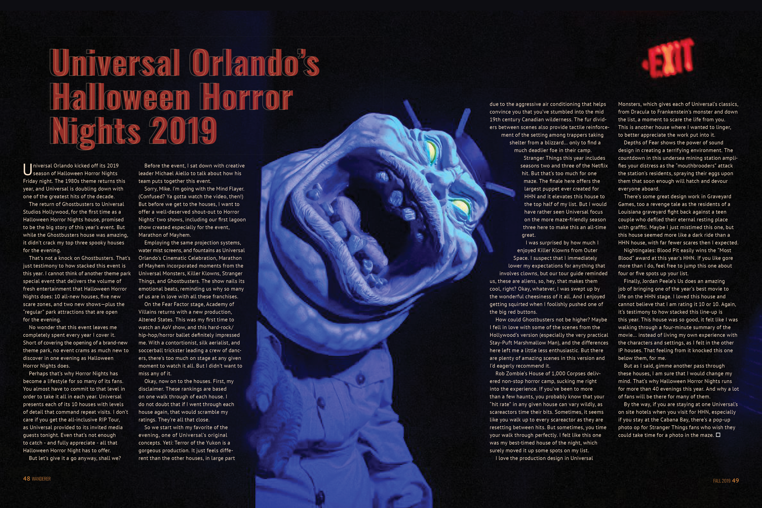
I have always been fascinated with the supernatural. The concept of being connected to the afterlife and how that all works is mysterious and intriguing. For the Fall edition the focus for quirky places is the paranormal. Haunted destinations, fall festivals and how to be prepared for a paranormal encounter.
Personas


Visual Concept
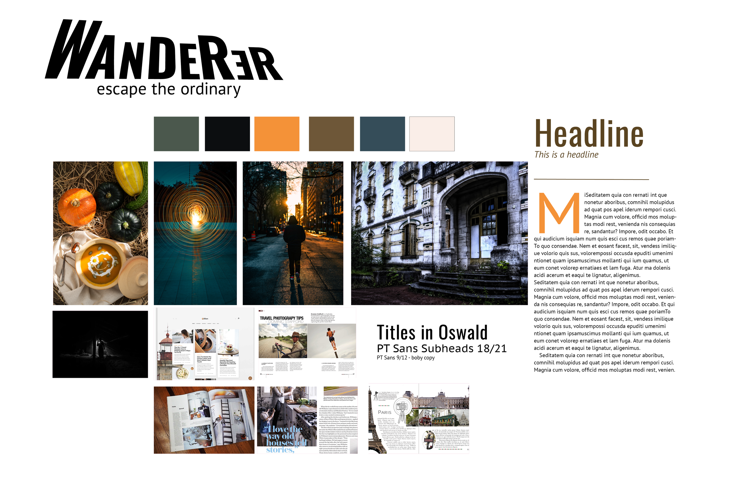
The Wanderer is minimalistic in design that draws attention to the images and information. Large white spaces and clean layouts.
Images: Candid and unaware of the camera. Rich in color with landscapes, cityscapes and architectural. The photographs are meant to draw the reader into the space.
Illustrations: Simple lines between paragraphs and subjects. The textures and patterns are simple and minimal elements on the pages.
Color: The pallet is limited to the six colors and tints that reflect urban, land and sky.
Typography: The titles are not too big as the images need to stand out, but are distinctive enough from the body text. Line and color will help with this distinction.
Moodboard and Visual Direction
Flatplan & Content
With these personas in mind I searched and found content on the web about haunted destinations, gathered images from various sources and used relevant ads from Ad World and laid them out in a flat plan.
Decided on the 10.5x8.5 size to give me the room I needed to give it the large images and white space desired. Built a rough table of contents for the front, middle and back parts of the magazine.
Original flat plan was 48 pages without the cover. This changed as I felt there was not enough content and added a few more articles. The final plan was 60 pages long.
Table of Contents

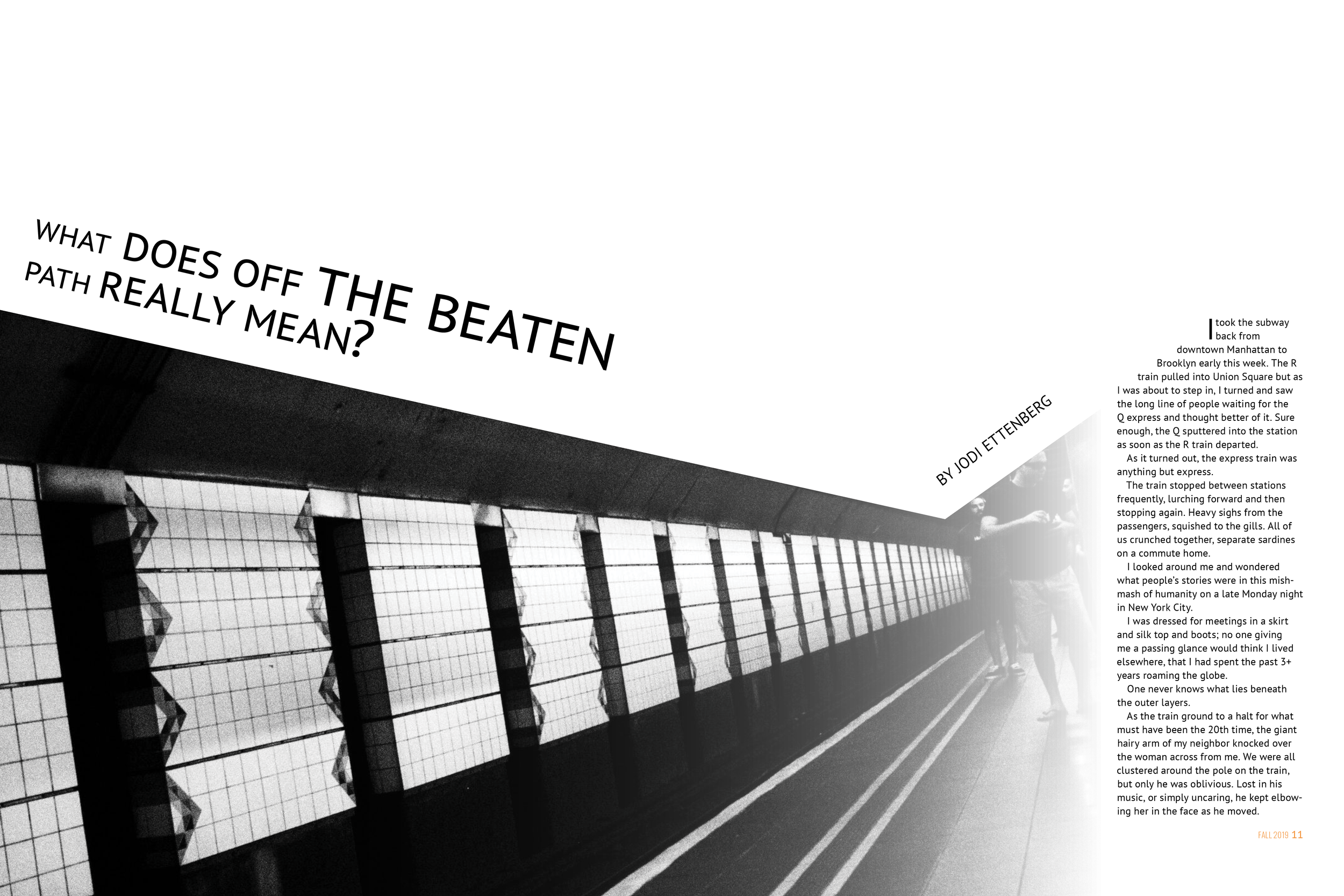
Layouts and Featured Articles
I began the layouts for the featured articles in the middle of the magazine articles using a modular grid. After which I built out the layouts for the front and back of the magazine articles consisting of letters to the editor, table of contents, sourcing of content, information about the Paranormal Society and how to be prepared for a ghost hunt.
Final Version
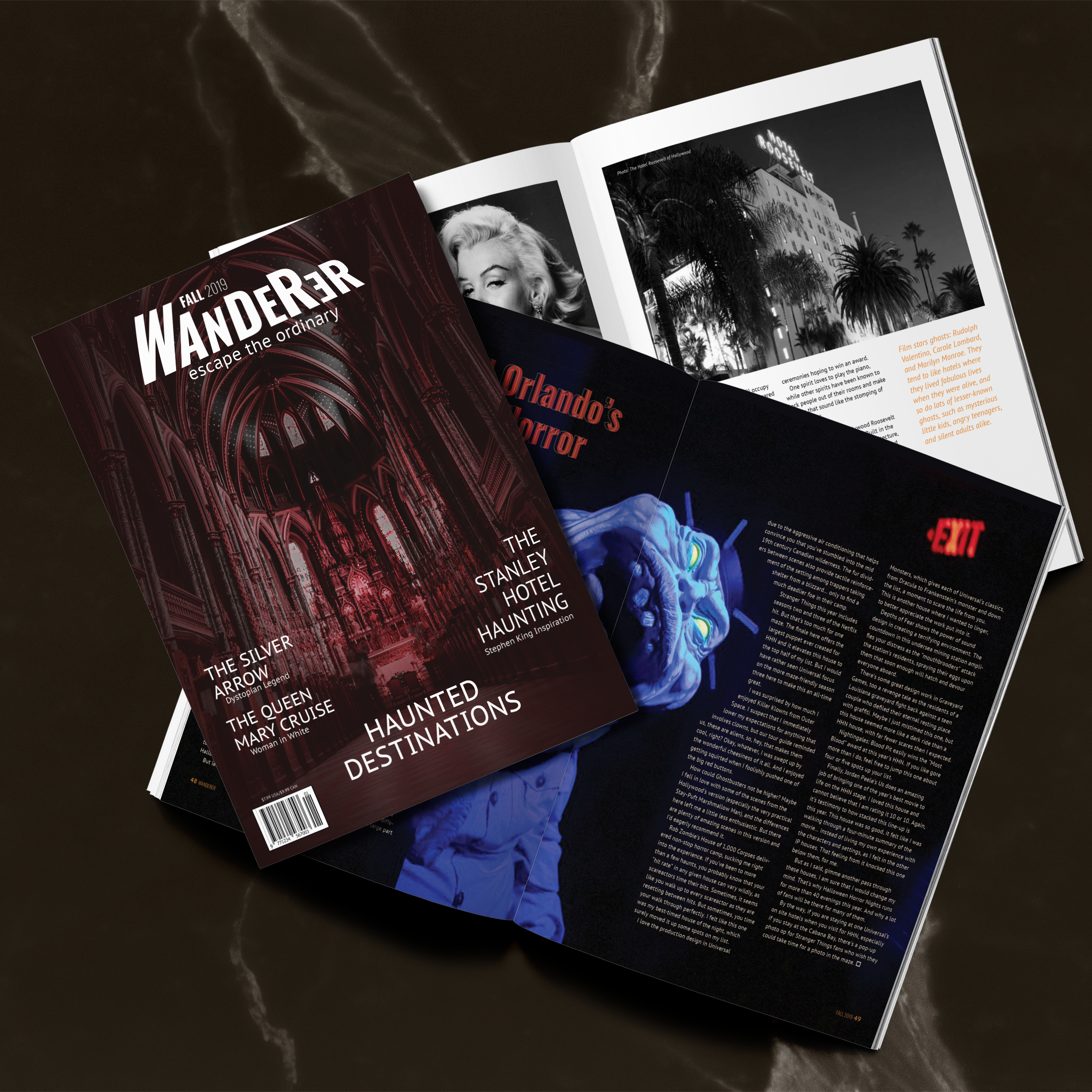
Here is the final version of the magazine.
Click on Image to view the magazine

Please click on the image to view the full magazine.
“There was much of the beautiful, much of the wanton, much of the bizarre, something of the terrible, and not a little of that which might have excited disgust.”
— Edgar Allan Poe, The Masque of the Red Death